|
For this assignment, I was asked to create a logo, and I decided to create a logo of myself. The most frustrating part of the process was actually coming up with the logos because I didn't have a lot of creativity. My favorite part was drawing, coloring, and modifying the designs because it was interesting to see the different logos being created. From this whole experienced, I learned how to design and improve my own logo without tracing something from the Internet. 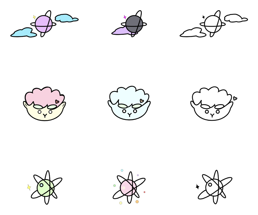 This final logo of me represents me because I love lambs. I also love strawberries and bananas, so I colored the head pink, eyebrows green, and the face yellow. When I was first creating my logo, I knew that I wanted to draw a lamb but I didn't know how, so I started with drawing a fluffy head and an oval face. Next, I added thick eyebrows and small eyes to make the design cuter. I think that this design of my lamb is unique because I never saw a lamb like this (<3). 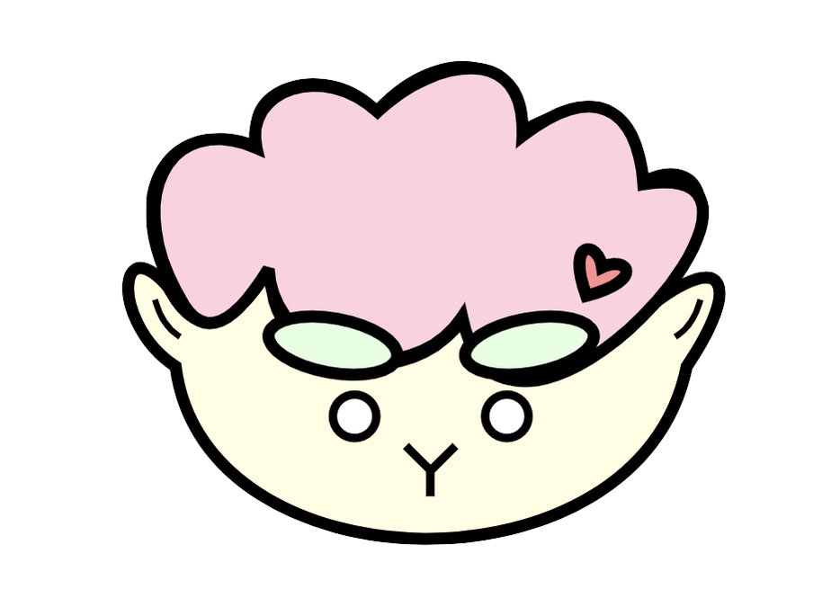
0 Comments
I chose the three logos below, that are circled with blue. The two logos with planets are for my curiosity about stars. Also, they are in the sky, and my goal is always to do my best (reach for the stars). The third logo is a lamb, and I drew it with my facial characteristics. It represents me, and I also love lambs (they're cute). I like the three logos that I choose because I think that it is cute and easy to remember. At first, the process of making these logos was hard, but once I started, it was easier. The part that I enjoyed the most was when I was drawing my logos.  |
