|
0 Comments
This is my Very first webpage:  This is my code that I wrote:  For this assignment, I was asked to create a logo, and I decided to create a logo of myself. The most frustrating part of the process was actually coming up with the logos because I didn't have a lot of creativity. My favorite part was drawing, coloring, and modifying the designs because it was interesting to see the different logos being created. From this whole experienced, I learned how to design and improve my own logo without tracing something from the Internet. 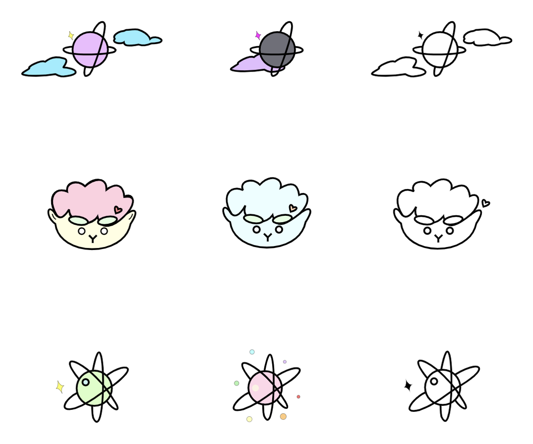 This final logo of me represents me because I love lambs. I also love strawberries and bananas, so I colored the head pink, eyebrows green, and the face yellow. When I was first creating my logo, I knew that I wanted to draw a lamb but I didn't know how, so I started with drawing a fluffy head and an oval face. Next, I added thick eyebrows and small eyes to make the design cuter. I think that this design of my lamb is unique because I never saw a lamb like this (<3). 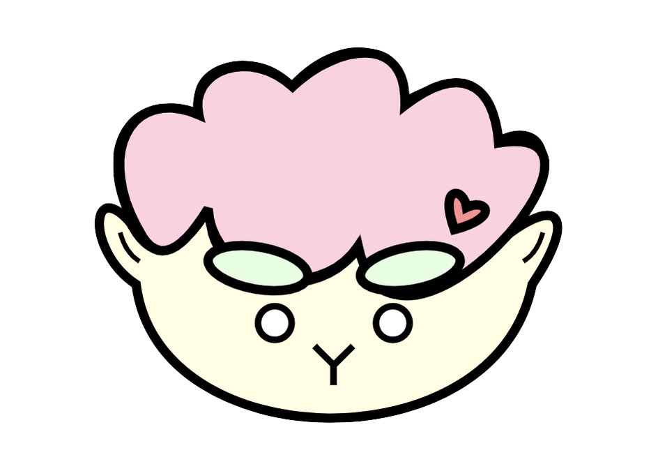 I chose the three logos below, that are circled with blue. The two logos with planets are for my curiosity about stars. Also, they are in the sky, and my goal is always to do my best (reach for the stars). The third logo is a lamb, and I drew it with my facial characteristics. It represents me, and I also love lambs (they're cute). I like the three logos that I choose because I think that it is cute and easy to remember. At first, the process of making these logos was hard, but once I started, it was easier. The part that I enjoyed the most was when I was drawing my logos.  For this assignment, I was asked to create four different color palettes, and each palette had to have five colors. To make the four palettes, I used Adobe Color, and to draw the model in my picture, I traced this. The types of the four different palettes were monochromatic, analogous, complementary, and triadic. Monochromatic is one hue, with variation of saturation and brightness. Analogous is hues that are next to each other on the color wheel. Complementary is combined hues from opposite side of the color wheel. Finally, triad combines three hues that are evenly spaced on the color wheel. My favorite color scheme was monochromatic, because it showed a variety of brightness of the same color. It was hard to trace and color the model, but it was fun to decide what color the model would wear. 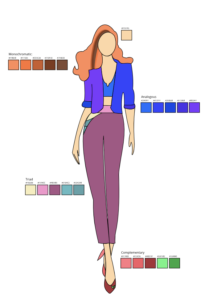 For this color names summative, I had to create an artwork that displayed at least 15 different colors. Next, I had to label the colors in two ways: RGB and Hexcodes. Also, I had to use the C.R.A.P. principle to align and display my work correctly and neatly. I made Ariana Grande by tracing this picture using pen tools on Gravit. A challenge I had to face was when I had to draw Ariana Grande. The picture I used had a lot of small details and it took a lot of time to trace every piece of detail. I overcame the challenge by zooming in to the picture and tracing the lines one by one. A success I achieved was to align everything neatly. One thing that I am proud of is that I got the idea to place Ariana Grande and the label in a black business card. I got the idea from the lyrics in Ariana Grande's song called 7 Rings. In Gravit, I used a tool called pen tools, which can be used to draw. Finally, I got my inspiration because my friends loves Ariana Grande (I do too, but not as much °-°.) 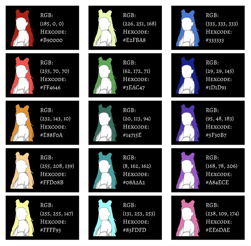 About Typography:Typography: (/tīˈpäɡrəfē/): the study or art of how texts look For the last few weeks, I learned about typography. There are five different fonts that I learned during class. The five fonts are serif, sans serif, monospaced, script or handwriting, and novelty. Serif fonts have "feet" and is used in print. Sans serif fonts don't have "feet" and are used on the web. They are also used for headlines, titles, and smaller chunks of text. Monospaced fonts' letters take up the same amount of space. They are used in coding, but don't work well for large blocks of text. Next, script or handwriting fonts include, cursive, calligraphy, and handwriting styles. They can be difficult to read, but are good for logos, large headlines, and details. Lastly, Novelty fonts gets attention and the popularity comes and goes. However, is important to use them sparingly. Also, not only did I learn how to make texts look better, I also learned why it is important. It is important because it communicates the message better, it looks more aesthetically pleasing, and it can gain the designer more credibility. The quote "Each font has a personality and a purpose" is very important in typography because every font looks different, and therefore, communicates the message differently and has specific words that go well with the font. Typeface Comparison:For this typeface comparison activity, we had to choose a font for each type (serif, sans serif, monospaced, script or handwritten, and novelty) and write a sentence. 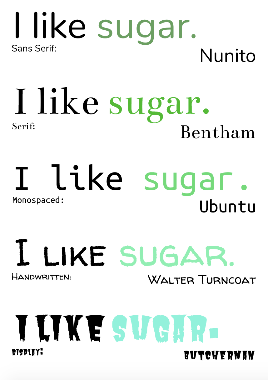 Word portraitsFor this typeface comparison activity, we had to select ten different kinds of fonts and write one word that matched that font and one word that didn't. 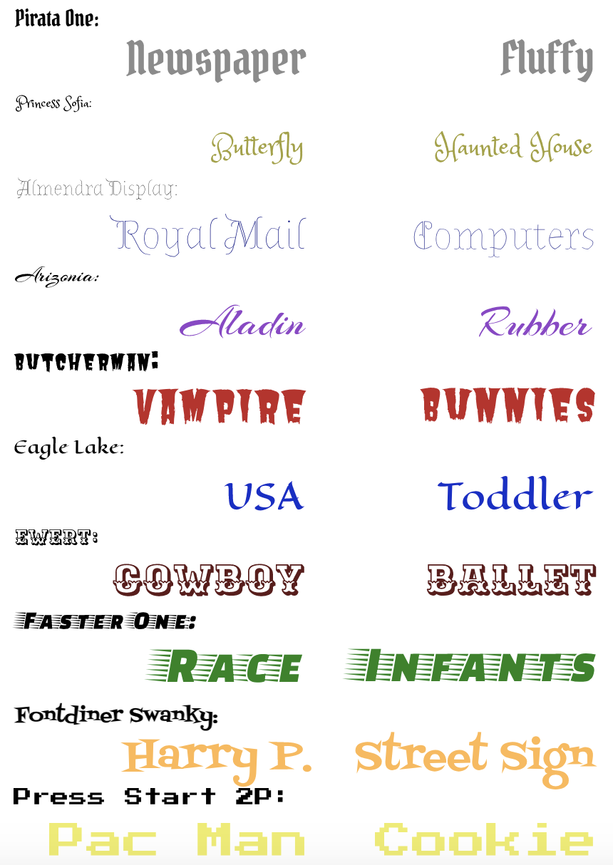 |