About Typography:Typography: (/tīˈpäɡrəfē/): the study or art of how texts look For the last few weeks, I learned about typography. There are five different fonts that I learned during class. The five fonts are serif, sans serif, monospaced, script or handwriting, and novelty. Serif fonts have "feet" and is used in print. Sans serif fonts don't have "feet" and are used on the web. They are also used for headlines, titles, and smaller chunks of text. Monospaced fonts' letters take up the same amount of space. They are used in coding, but don't work well for large blocks of text. Next, script or handwriting fonts include, cursive, calligraphy, and handwriting styles. They can be difficult to read, but are good for logos, large headlines, and details. Lastly, Novelty fonts gets attention and the popularity comes and goes. However, is important to use them sparingly. Also, not only did I learn how to make texts look better, I also learned why it is important. It is important because it communicates the message better, it looks more aesthetically pleasing, and it can gain the designer more credibility. The quote "Each font has a personality and a purpose" is very important in typography because every font looks different, and therefore, communicates the message differently and has specific words that go well with the font. Typeface Comparison:For this typeface comparison activity, we had to choose a font for each type (serif, sans serif, monospaced, script or handwritten, and novelty) and write a sentence. 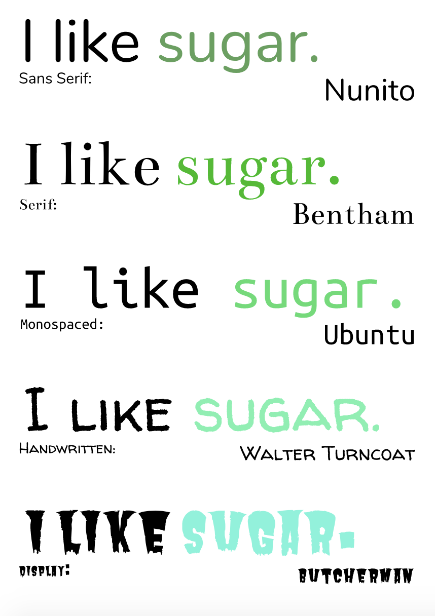 Word portraitsFor this typeface comparison activity, we had to select ten different kinds of fonts and write one word that matched that font and one word that didn't. 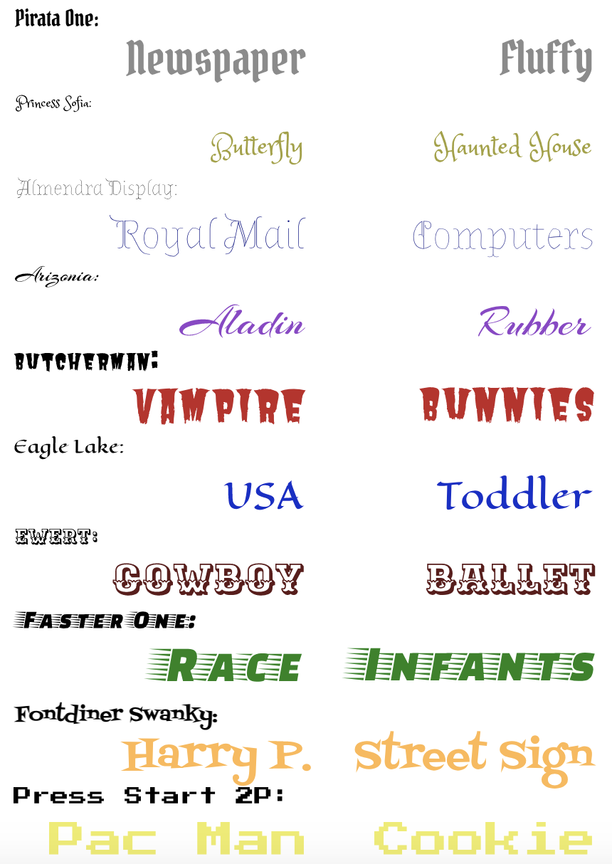
0 Comments
|
